第1节:详解布局

参考文章:

一、基础知识

1.spaceEvently

一行中如果有2个widget(五个五角星暂且看成1个widget),那么除去2widget所占据的宽度,3个红色方块宽度是一样的, 如下图所示

img

2.spaceBetween

一行中如果有2个widget,那么分布2端,如下图所示

img

3.spaceAround

一行中如果有2个widget,那么每个widget左右都是相同的方块,如下图所示

img

类型 含义 row举例 column举例
start
(default)
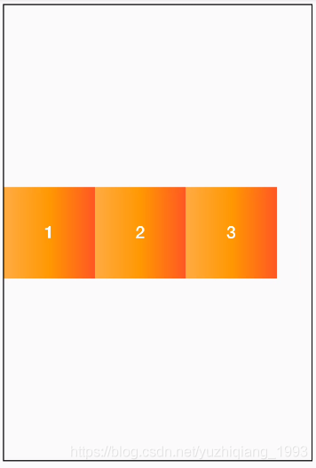
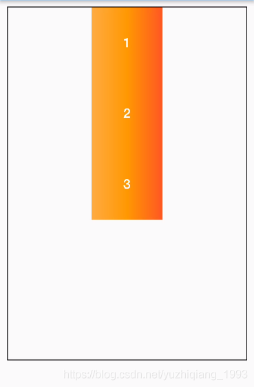
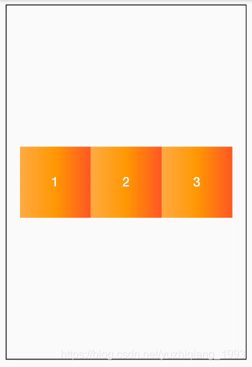
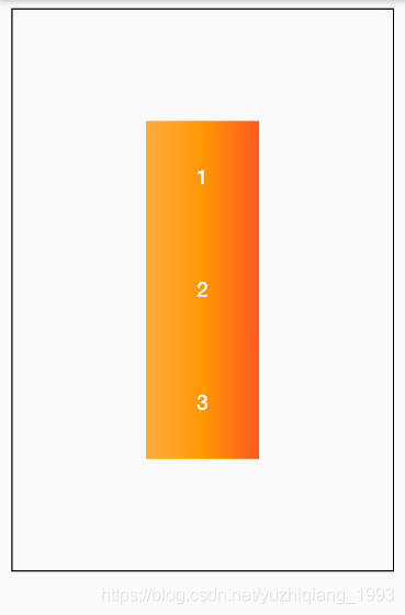
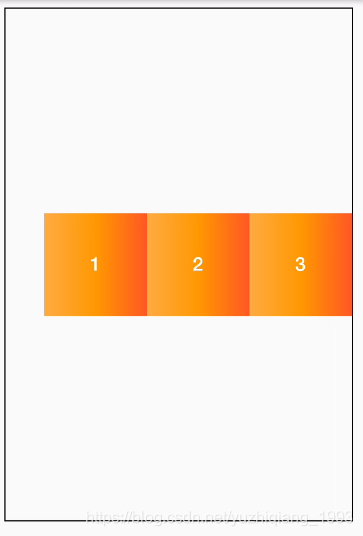
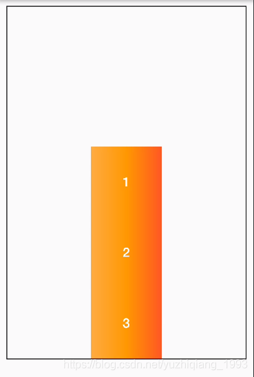
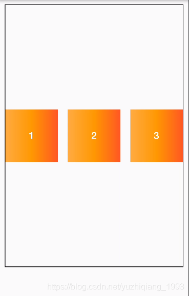
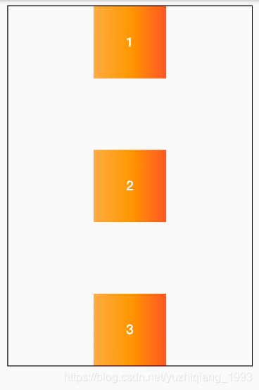
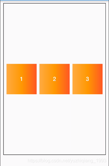
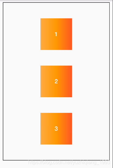
从行首开始排列。每行第一个弹性元素与行首对齐,同时所有后续的弹性元素与前一个对齐 在这里插入图片描述 在这里插入图片描述
start
textDirection: TextDirection.rtl,
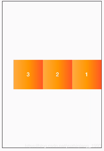
textDirection的值为从右至左 row_start-rtl 在这里插入图片描述
center 伸缩元素向每行中点排列。每行第一个元素到行首的距离将与每行最后一个元素到行尾的距离相同。 在这里插入图片描述 在这里插入图片描述
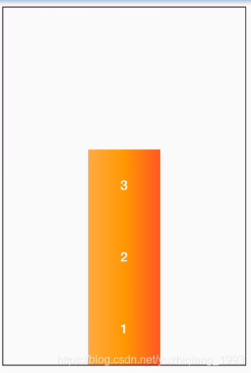
end 从行尾开始排列。每行最后一个弹性元素与行尾对齐,其他元素将与后一个对齐。 在这里插入图片描述 在这里插入图片描述
space-between 在每行上均匀分配弹性元素。相邻元素间距离相同。每行第一个元素与行首对齐,每行最后一个元素与行尾对齐。 在这里插入图片描述 在这里插入图片描述
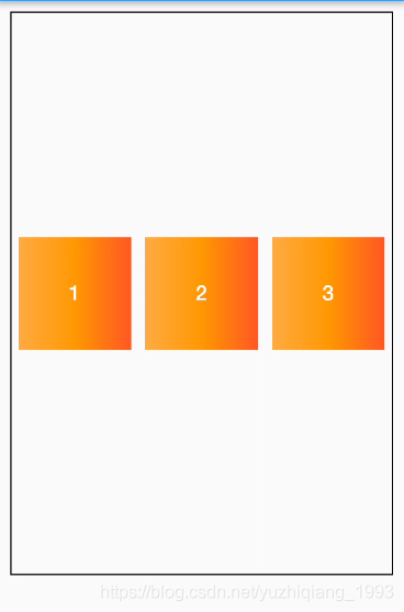
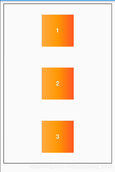
space-around 在每行上均匀分配弹性元素。相邻元素间距离相同。每行第一个元素到行首的距离和每行最后一个元素到行尾的距离将会是相邻元素之间距离的一半。 在这里插入图片描述 在这里插入图片描述
spaceEvenly 将主轴空白区域均分,使各个子控件间距相等 在这里插入图片描述 在这里插入图片描述

expand 要再column或row中使用

层叠

4.6 层叠布局 Stack、Positioned

eg:在视图上,显示loading动画

问:flutter text 左对齐_如何在Flutter中将文本垂直和水平居中?

答:首先可以使用Center让控件居中,其次使用textAlign设置水平居中,示例代码如下:

1
2
3
4
5
6
child: Center(
child: Text(
"Hello World",
textAlign: TextAlign.center,
),
),

flutter 隐藏显示控件

1
2
3
4
Offstage(
offstage: true, //true隐藏,false显示
child: '子控件',
),

详解Platform Channel

参考文章:

一、基础知识

1、Channel

Flutter定义了三种不同类型的Channel,分别如下:

Channel类型 用途
BasicMessageChannel 用于传递字符串和半结构化的信息
MethodChannel 用于传递方法调用(method invocation)
EventChannel 用于数据流(event streams)的通信
  • MethodChannel传递的数据支持什么类型?
  • Dart数据类型与Android,iOS类型的对应关系是怎样的?

这两个问题的答案同样来自官方文档:

Dart Android iOS
null null nil (NSNull when nested)
bool java.lang.Boolean NSNumber numberWithBool:
int java.lang.Integer NSNumber numberWithInt:
int if 32 bits not enough java.lang.Long NSNumber numberWithLong:
double java.lang.Double NSNumber numberWithDouble:
String java.lang.String NSString
Uint8List byte[] FlutterStandardTypedData typedDataWithBytes:
Int32List int[] FlutterStandardTypedData typedDataWithInt32:
Int64List long[] FlutterStandardTypedData typedDataWithInt64:
Float64List double[] FlutterStandardTypedData typedDataWithFloat64:
List java.util.ArrayList NSArray
Map java.util.HashMap NSDictionary
Class Note
BinaryCodec 二进制数据类型,泛型对应 ByteBuffer,传递 byte 数组时使用
JSONMessageCodec Json消息类型,泛型对应 Object。传递 Json时可使用
StringCodec 字符串消息类型,泛型对应 String。传递字符串
StandardMessageCodec 标准消息类型,泛型对应 Object。传递 Map 等的时候可使用此类型

第7.2节:详解Animation-2动画组

详解Animation-2动画组

参考文章:

一、Animation动画组-串行

参考文档:

串行动画的实现方案总共有三种,分别是 监听状态法, Interval时间间隔法, TweenSequence动画序列法.

1、监听状态法

状态监听法主要通过AnimationController监听动画的completed状态,然后再去执行下一个动画,如此往复,直到所有动画完成.

例如现在我们需要实现先执行组件在0.3秒钟往下偏移50个单位,然后再执行在0.6s中组件的颜色由 橘色 变为 红色.

整体Demo代码如下所示:

1
2
3
4
5
6
7
8
9
10
11
12
13
14
15
16
17
18
19
20
21
22
23
24
25
26
27
28
29
30
31
32
33
34
35
36
37
38
39
40
41
42
43
44
45
46
47
48
49
50
51
52
53
54
55
56
57
58
59
60
61
62
63
64
65
66
67
68
69
70
71
72
73
74
75
class FlutterAnimationWidget extends StatefulWidget {
TurnTableLotteryPage({Key key}) : super(key: key);

@override
_FlutterAnimationWidgetState createState() => _FlutterAnimationWidgetState();
}

class _FlutterAnimationWidgetState extends State<FlutterAnimationWidget> with TickerProviderStateMixin {
// ①声明位移动画控制器和颜色动画控制器以及位移动画和颜色动画
AnimationController _animationController;
Animation<double> _animation;
AnimationController _colorAnimationController;
Animation<Color> _colorAnimation;

@override
void initState() {
super.initState();

// ②分别创建位移、颜色的动画控制器和动画
_animationController = AnimationController(duration: Duration(milliseconds: 300), vsync: this);
// Tween对象调用`animate()`函数直接传入上面的AnimationController
_animation = Tween<double>(begin: 0, end: 50).animate(_animationController)
..addListener(() {
setState(() {});
});
_colorAnimationController = AnimationController(duration: Duration(milliseconds: 600), vsync: this);
_colorAnimation = ColorTween(begin: Colors.orangeAccent, end: Colors.redAccent).animate(_colorAnimationController)
..addListener(() {
setState(() {});
});

// ③最后,我们只需要监听位移动画完成状态之后执行颜色动画即可,
_animationController.addStatusListener((status) {
if (status == AnimationStatus.completed) {
_colorAnimationController.forward();
};
});
}

void startEasyAnimation() {
_animationController.forward();
}

@override
void dispose() {
_animationController.dispose();
super.dispose();
}

@override
Widget build(BuildContext context) {
return Scaffold(
body: Center(
child: Column(
mainAxisAlignment: MainAxisAlignment.center,
children: <Widget>[
Container(
width: 200,
height: 50,
color: _colorAnimation.value,
margin: EdgeInsets.only(top: _animation.value),
),
FlatButton(
onPressed: startEasyAnimation,
child: Text(
"点击执行最简单动画",
style: TextStyle(color: Colors.black38),
),
),
],
),
),
);
}
}

2、Interval时间间隔法

上面的状态监听需要一个动画过程就写一个Controller,而且基本上还要每一个Controller都监听执行完成然后再去启动下一个Controller.如果一个动画过程有十几个,自己想想都是脑瓜子嗡嗡的.所以接下来我们就来介绍第二种方案 - Interval时间间隔法 .

Interval时间间隔法 的整体思路是一个动画Controller控制所有动画的执行.然后每一个动画只需要确认自己在整个动画的时间比重即可.

整体Demo代码如下所示:

1
2
3
4
5
6
7
8
9
10
11
12
13
14
15
16
17
18
19
20
21
22
23
24
25
26
27
28
29
30
31
32
33
34
35
36
37
38
39
40
41
42
43
44
45
46
47
48
49
50
51
52
53
54
55
56
57
58
59
60
61
62
63
64
65
66
67
68
69
70
71
72
73
74
75
class FlutterAnimationWidget extends StatefulWidget {
TurnTableLotteryPage({Key key}) : super(key: key);

@override
_FlutterAnimationWidgetState createState() => _FlutterAnimationWidgetState();
}

class _FlutterAnimationWidgetState extends State<FlutterAnimationWidget> with TickerProviderStateMixin {
// ①声明一个动画Controller和多个动画.
AnimationController _animationController;
Animation<double> _animation;
Animation<Color> _colorAnimation;

@override
void initState() {
super.initState();

// 然初始化AnimationController,AnimationController的动画时间(**duration**)要设置成所有动画的总时长,例如这里我设定为600毫秒(_animation时长:300毫秒,_colorAnimation时长:300毫秒).
_animationController = AnimationController(duration: Duration(milliseconds: 600), vsync: this);
// Tween对象调用`animate()`函数不再是直接传入上面的AnimationController,而是传入一个 CurvedAnimation 对象。
// 其中CurvedAnimation构建过程中需要传入两个参数一个是 parent ,用于指定AnimationController. 另外一个是 curve,用于指定动画曲线函数.我们可以使用常用的动画曲线函数,也可以自己生成,这里我们就自己生成.指定动画执行的时间区间.
_animation = Tween<double>(begin: 0, end: 50).animate(
CurvedAnimation(
parent: _animationController,
curve: Interval(0.0, 0.5), // 由于两个动画时间长度是对分的,每一个都是300毫秒,所以 curve 参数中的值就分别是 **Interval(0.0, 0.5)**、**Interval(0.5, 1.0)**
),
)..addListener(() {
setState(() {});
});
_colorAnimation = ColorTween(begin: Colors.orangeAccent, end: Colors.redAccent).animate(
CurvedAnimation(
parent: _animationController,
curve: Interval(0.5, 1.0),// 由于两个动画时间长度是对分的,每一个都是300毫秒,所以 curve 参数中的值就分别是 **Interval(0.0, 0.5)**、**Interval(0.5, 1.0)**
),
)..addListener(() {
setState(() {});
});
}

void startEasyAnimation() {
_animationController.forward();
}

@override
void dispose() {
_animationController.dispose();
super.dispose();
}

@override
Widget build(BuildContext context) {
return Scaffold(
body: Center(
child: Column(
mainAxisAlignment: MainAxisAlignment.center,
children: <Widget>[
Container(
width: 200,
height: 50,
color: _colorAnimation.value,
margin: EdgeInsets.only(top: _animation.value),
),
FlatButton(
onPressed: startEasyAnimation,
child: Text(
"点击执行最简单动画",
style: TextStyle(color: Colors.black38),
),
),
],
),
),
);
}
}

3、TweenSequence动画序列法

上面的两种方案虽然能解决动画组的问题,但是都太过于繁琐,那么有没有一种比较优雅的方案呢?这就需要使用到 TweenSequenceTweenSequenceItem 这两个类了. 其中 TweenSequence 是动画组类,TweenSequenceItem 则是用来定义每一个动画的具体实现的类.但是TweenSequenceTweenSequenceItem也不是尽善尽美的,它最大的问题就是前后变化的属性值类型必须是一致的.

下面,我们仍然以改变Margin为例, 先让视图组件往上移动50,再让视图 来看看如何使用 TweenSequenceTweenSequenceItem 来实现这个动画.

整体代码如下所示:

1
2
3
4
5
6
7
8
9
10
11
12
13
14
15
16
17
18
19
20
21
22
23
24
25
26
27
28
29
30
31
32
33
34
35
36
37
38
39
40
41
42
43
44
45
46
47
48
49
50
51
52
53
54
55
56
57
58
59
60
61
62
63
64
65
66
67
68
69
70
71
72
73
74
75
76
class FlutterAnimationWidget extends StatefulWidget {
TurnTableLotteryPage({Key key}) : super(key: key);

@override
_FlutterAnimationWidgetState createState() => _FlutterAnimationWidgetState();
}

class _FlutterAnimationWidgetState extends State<FlutterAnimationWidget> with TickerProviderStateMixin {
// ①声明一个 动画控制器AnimationController 和 动画Animation.
AnimationController _animationController;
Animation<double> _animation;

@override
void initState() {
super.initState();
// 仍然以两者的动画总时长为600毫秒为例
_animationController = AnimationController(duration: Duration(milliseconds: 600), vsync: this);

// 然后,我们通过 **TweenSequence** 和 **TweenSequenceItem** 这两个类对 动画Animation 进行实现.
// 实现两个 **TweenSequenceItem**, **TweenSequenceItem**中的 <font color=red>weight</font> 属性是来设定动画执行的时间权重.也就是在整个动画过程,当前动画执行时长占总时长的比例.例如下面 第一个动画插值占的时间比例为 `50/(50 + 100)`. 第二个动画插值占的时间比例为 `100/(50 + 100)` .
TweenSequenceItem downMarginItem = TweenSequenceItem<double>(
tween: Tween(begin: 1.0, end: 50.0),
weight: 50,
);
TweenSequenceItem upMarginItem = TweenSequenceItem<double>(
tween: Tween(begin: 50.0, end: 100.0),
weight: 100,
);
// 然后创建一个动画插值组,把上面两个动画插值放入组中.
TweenSequence tweenSequence = TweenSequence<double>([
downMarginItem,
upMarginItem,
]);
// 最后,生成动画就OK了.
_animation = tweenSequence.animate(_animationController);
_animation.addListener(() {
setState(() {});
});
}

void startEasyAnimation() {
_animationController.forward();
}

@override
void dispose() {
_animationController.dispose();
super.dispose();
}

@override
Widget build(BuildContext context) {
return Scaffold(
body: Center(
child: Column(
mainAxisAlignment: MainAxisAlignment.center,
children: <Widget>[
Container(
width: 200,
height: 50,
color: Colors.orangeAccent,
margin: EdgeInsets.only(top: _animation.value),
),
FlatButton(
onPressed: startEasyAnimation,
child: Text(
"点击执行最简单动画",
style: TextStyle(color: Colors.black38),
),
),
],
),
),
);
}
}
动画组实现总结

上面三种实现动画组基本上已经说完了,接下来我们就来对比其不同点.

特性 监听状态法 Interval时间间隔法 TweenSequence动画序列法
代码简洁度 🔅🔅 🔅🔅🔅 🔅🔅🔅🔅🔅
动画是否可交织
动画属性是否可以多变

动画是否可交织 : 动画可否交织主要是说两个动画之间是否需要上一个动画完全执行完成之后,下一个动画才能执行.

动画属性是否可以多变 : 动画属性多变是指当前动画过程中可变化的属性是否可以有多个,例如同时变化尺寸和颜色等等.

第7.1节:详解Animation-1基础

详解Animation-1基础

参考文章:

一、动画入门

请点击进入阅读:【Flutter】Animation 动画 ( Flutter 动画基本流程 | 创建动画控制器 | 创建动画 | 设置值监听器 | 设置状态监听器 | 布局中使用动画值 | 动画运行 )

二、Animation、AnimationController、Tween

以下内容摘自:Flutter动画 2 - Animation、Tween 详解

Tween的唯一职责就是定义从输入范围到输出范围的映射。输入范围通常为0.0到1.0

1
final Tween doubleTween = new Tween<double>(begin: -200.0, end: 0.0);

AnimationController 首先是继承于 Animation 的, 相对Animation而言,AnimationController作用则是控制动画.它可以设置动画的时长,并且包含动画的执行方法,具体如下表格所示.

AnimationController 的常用操作说明:

动画执行方法 说明
forward() 正向开始执行动画
reverse() 反向开始执行动画
reset() 重置动画到初始状态
dispose() 取消/停止动画

flutter AnimationStatus 动画状态说明:

AnimationStatus 动画状态值 说明
AnimationStatus.forward 执行 controller.forward() 会回调此状态
AnimationStatus.reverse 执行 controller.reverse() 会回调此状态
AnimationStatus.dismissed 动画从 controller.reverse() 反向执行 结束时会回调此方法
AnimationStatus.completed 动画从 controller.forward() 正向执行 结束时会回调此方法
1
2
3
4
5
6
7
8
9
10
11
12
13
14
15
16
17
18
19
_animationController = AnimationController(duration: Duration(milliseconds: 300), 

// 位移动画
_positionAnimation = Tween<double>(begin: 0, end: 50).animate(_animationController)
..addListener(() {
setState(() {});
});

// 颜色动画
_colorAnimation = ColorTween(begin: Colors.orangeAccent, end: Colors.redAccent).animate(_animationController)
..addListener(() {
setState(() {});
});

_animationController.addStatusListener((status) {
if (status == AnimationStatus.completed) {
print("动画完成");
}
});

三、旋转动画 RotationTransition

End

第4节:详解TextField

参考文章:

一、TextField class

1
2
3
4
5
6
7
8
9
10
11
12
13
14
15
16
17
18
19
20
21
22
23
24
25
26
27
28
29
30
31
32
33
34
35
36
37
38
39
40
const TextField({
Key key,
this.controller,// 文本控制器,详见下文
this.focusNode, // 焦点,详见下文
this.decoration = const InputDecoration(), // 输入框装饰器,详见下文
TextInputType keyboardType,
this.textInputAction, //更改键盘本身的操作按钮,详见下文
this.textCapitalization = TextCapitalization.none, //提供了一些有关如何使用户输入中的字母大写的选项
this.style,
this.textAlign = TextAlign.start,
this.textDirection,
this.autofocus = false, // 是否自动获取焦点
this.obscureText = false, // 是否隐藏正在编辑的文本,如用于输入密码的场景等,文本内容会用“•”替换。
this.autocorrect = true,
this.maxLines = 1, // 能写入的最大行数
this.maxLength, // 能写入的最大字符数
this.maxLengthEnforced = true,
this.onChanged, // 文本框事件:文字改变触发
this.onEditingComplete, // 文本框事件:当用户提交可编辑内容时调用(常用于“焦点(FocusNode)”变更)
this.onSubmitted, // 文本框事件:文字提交触发(键盘按键)
this.inputFormatters,
this.enabled,
this.cursorWidth = 2.0, // 光标宽度 Colors.red
this.cursorRadius, // 光标半径 Radius.circular(16.0)
this.cursorColor, // 光标颜色 16.0
this.keyboardAppearance,
this.scrollPadding = const EdgeInsets.all(20.0),
this.enableInteractiveSelection = true,
this.onTap, // 文本框事件:
}) : assert(textAlign != null),
assert(autofocus != null),
assert(obscureText != null),
assert(autocorrect != null),
assert(maxLengthEnforced != null),
assert(scrollPadding != null),
assert(maxLines == null || maxLines > 0),
assert(maxLength == null || maxLength > 0),
keyboardType = keyboardType ?? (maxLines == 1 ? TextInputType.text : TextInputType.multiline),
assert(enableInteractiveSelection != null),
super(key: key);

二、文本框的输入器装饰 InputDecoration decoration

1
2
3
4
5
6
7
8
9
10
11
12
13
14
15
16
17
18
19
20
21
22
23
24
25
26
27
28
29
30
31
32
33
34
35
36
37
38
const InputDecoration({
this.icon,
this.labelText,
this.labelStyle,
this.helperText,
this.helperStyle,
this.hintText,
this.hintStyle,
this.errorText,
this.errorStyle,
this.errorMaxLines,
this.hasFloatingPlaceholder = true,
this.isDense,
this.contentPadding,
this.prefixIcon,
this.prefix,
this.prefixText,
this.prefixStyle,
this.suffixIcon,
this.suffix,
this.suffixText,
this.suffixStyle,
this.counterText,
this.counterStyle,
this.filled,
this.fillColor,
this.errorBorder,
this.focusedBorder,
this.focusedErrorBorder,
this.disabledBorder,
this.enabledBorder,
this.border,
this.enabled = true,
this.semanticCounterText,
}) : assert(enabled != null),
assert(!(prefix != null && prefixText != null), 'Declaring both prefix and prefixText is not allowed'),
assert(!(suffix != null && suffixText != null), 'Declaring both suffix and suffixText is not allowed'),
isCollapsed = false;

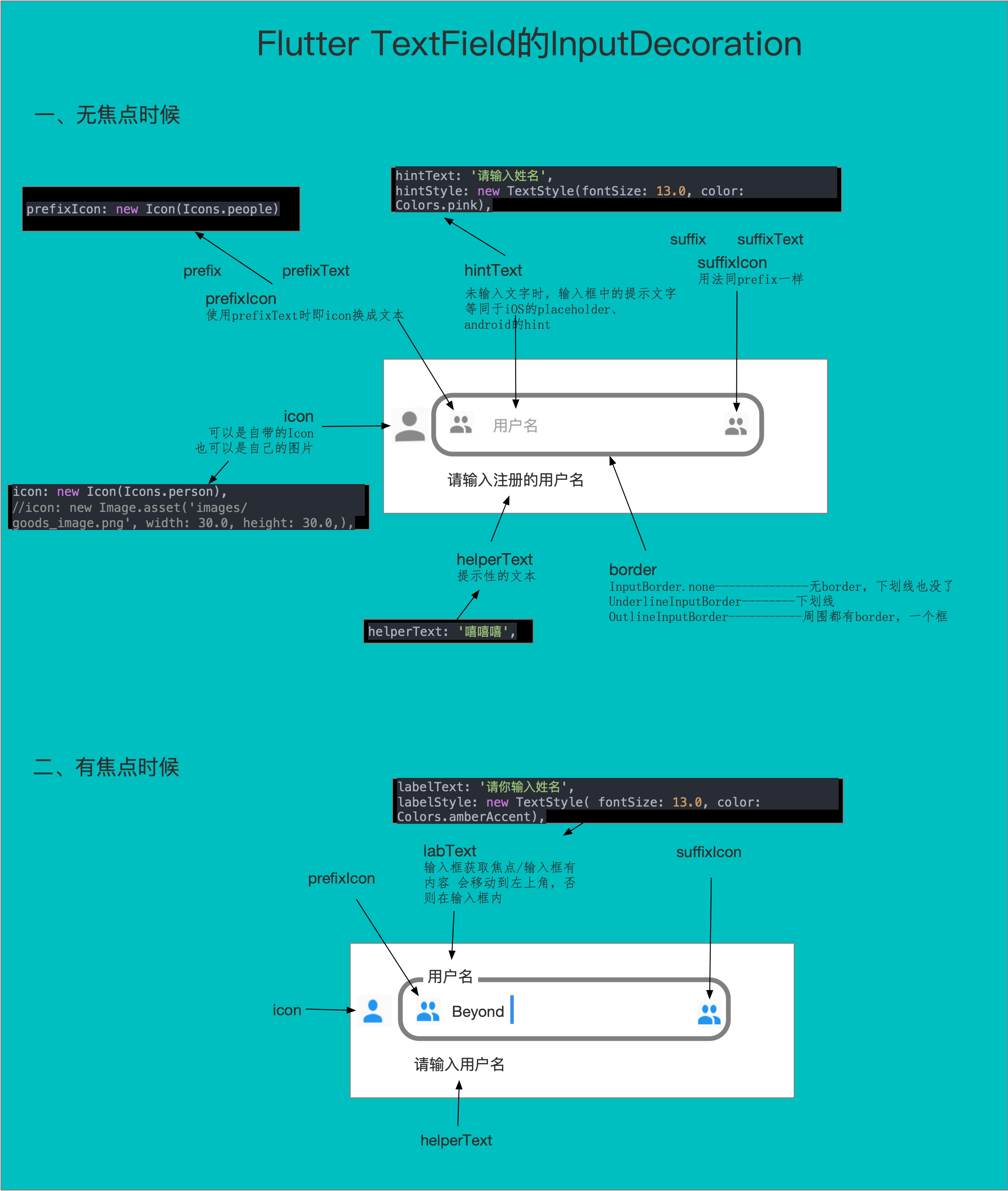
图解如下:

Flutter TextField

输入器装饰 InputDecoration decoration的其他参数

参数 作用 备注
contentPadding 内容的边距,默认是有一个边距的 contentPadding: new EdgeInsets.all(0.0)

2、文本控制器 TextEditingController controller

controller.clear() 清空了用户名输入框中的内容

3、键盘输入类型 TextInputType keyboardType

键盘输入类型(数字,文本等各种类型):设置TextField获得焦点的时候弹出的键盘

类型 作用
TextInputType.number 数字键盘
TextInputType.text 普通完整键盘
TextInputType.emailAddress 带有“@”的普通键盘
TextInputType.datetime 带有“/”和“:”的数字键盘
TextInputType.multiline 带有选项以启用有符号和十进制模式的数字键盘

4、键盘本身的操作按钮 TextInputAction

1
2
3
TextField(
textInputAction: TextInputAction.search,
),

5、TextCapitalization

类型 作用
TextCapitalization.characters 大写句子中的所有字符
TextCapitalization.words 将每个单词的首字母大写

6、文本框的其他参数

见类结构

二、键盘

Flutter | 滚动 PageView 自动关闭键盘

1
2
3
4
5
PageView(
onPageChanged: (index) {
WidgetsBinding.instance?.focusManager.primaryFocus?.unfocus();
}
)

第1节:详解Button

参考文章:

一、基础知识

1、继承关系

Object > Diagnosticable > DiagnosticableTree > Widget > StatelessWidget > MaterialButton > RaisedButton、FlatButton、OutlineButton

  • 2021-12-18

TextButton 是 1.20.0 推出的一个新的按钮

Flutter TextButton 详细使用配置、Flutter ButtonStyle概述实践

flutter 2.0版本新增了三个按钮

TextButton、OutlinedButton、ElevatedButton

2、类

RaisedButton Material Design中的button, 一个凸起的材质矩形按钮。
FlatButton Material Design中的button,一个没有阴影的材质设计按钮。
OutlineButton Material Design中的button,RaisedButton和FlatButton之间的交叉:一个带边框的背景透明的按钮,当按下按钮时,其高度增加,背景变得不透明。
IconButton 用于创建仅包含图标的按钮,参数就不再讲解
DropdownButton 一个显示可供选择的选项的按钮
FloatingActionButton 材质应用程序中的圆形按钮
InkWell 实现平面按钮的墨水飞溅部分

RaisedButton、FlatButton、OutlineButton三个控件都继承于MaterialButton,查看源码会发现MaterialButton由RawMaterialButton(无主题Button)构建的。而RawMaterialButton与CupertinoButton是一对button组合,都继承于StatefulWidget,前者是google风格,后者iOS风格!

附:使用CupertionBUtton要注意导入库:import ‘package:flutter/cupertino.dart’;

二、 MaterialButton参数详解

这里我们仅对个别不好理解的做解释。

属性 作用 备注
VoidCallback onPressed 点击激活按钮时调用的方法
ValueChanged onHighlightChanged 按下和抬起时都会调用的方法,详看后面示例
ButtonTextTheme textTheme 定义按钮的基色,以及按钮的最小尺寸,内部填充和形状的默认值。
Color disabledTextColor 未设置按钮点击回调时使用的文本颜色
Color splashColor 按钮被按下的水波纹颜色,默认是有值的,不要要水波纹效果设置透明颜色即可!
colorBrightness 按钮的主题亮度,当设置了textColor、color颜色,此值无效!

更多内容参考:Flutter RaisedButton、FlatButton、OutlineButton 参数详解